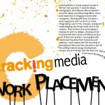
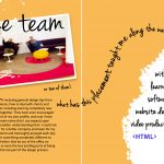
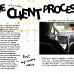
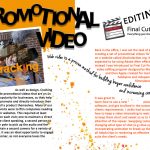
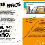
These are JPG’s, of my concertina book I created to demonstrate the period of time I’d spent at work experience with Cracking Media. I aimed to show through the design and wording, that I really enjoyed the time I’d spent working within the company. Orange is the symbolic colour for the company, which is why i decided to stick to the pattern, although orange may not have been my favourite colour to begin with; it’s definitely growing on me. The flowing text from one page to another was to help each page flow into the next. Although the book is folded, it can be pulled out completely, which was another opportunity for the flowing text between paragraphs to stand out. I included two pictures I’d taken myself of the team, and one of the ‘boss’ with his camera; they really help to represent the fun I had and type of people I’d been working with. I experimented with rearranging the lettering for my headers and used a hand written font for minor notes for the reader that help to describe what’s going on. I’m fairly proud of what that end result turned out to be! Maybe print media is the road to go down for me…