
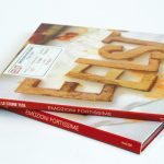
These images are of typography created from potato sliced and fried to be used in promotional material for a band. Although I couldn’t find the designer, I found this particular experiment helpful for layout and the impact physical type imagery can have on the cover of a book. The space around the type is white and it works very well in keeping the focus on the imagery and it’s importance.