So what is ridiculous typography?
My theme for my magazine spread about Oded Ezer is ‘ridiculous typography’.
To expand further I need to determine what really is ridiculous typography? Is it 3D typography that I’ve favored in my recent posts. Or is ridiculous type something unreadable and pointless? In my opinion, ridiculous typography could be something that’s not useful?
“The third way of guidelines for Hebrew I am very interested in: being influences by a different, detached field e.g. by nature, science or architecture.” – Oded Ezer
This quote was from one of the interviews with Oded Ezer where he talks about how Hebrew has to have a genre. I’ve decided to apply the a simila genre to my own work to give myself a guideline to work with when experimenting with typography.
My guidelines are:
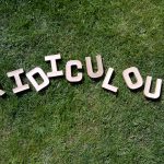
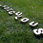
Allowing nature to determine the typography (Tree balks form into the shapes).
Molding nature to create typography (Cutting out lettering from leaves).
Creating typography out of natural objects.
These all use the genre of nature to influence the outcome of type.
The photos above I creating by placing typography into a natural setting, they’re not brilliant experiments; however they’re a starting point to work from.