My final Storyboard in snapshots.
Evaluation of my screen based communication:
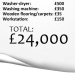
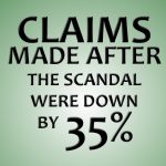
My initial aim throughout the project was to create an animation that would connect to those with political knowledge of the expense scandal and our members of parliament. I aimed to catch their attention by adding comic humour to the motion graphic that would entice the watcher to continue watching with interest. My statistics ‘picked at random’ were based around the percentage of expense claims made after the expense scandal. As an article via the Guardian, they’re simple stats that needed to be brought to life. My idea to bring the stats to life was to include ‘the most bizarre expense claims’, for example;
Gordon Brown, claimed for a collection of photos of himself to be printed and framed.
Mp Sir Peter Viggers was found to have claimed an essential part to a second home: his floating duck house that wa to keep his sucks safe from foxes.
Mp Barbara Follett claimed £25,000 worth of security patrols after she was mugged and didn’t feel safe in London, but who does?
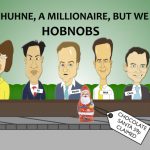
Mp Chris Huhne became popular for submitting a receipt with hobnobs, which created the headline ‘Chris Huhne, a millionaire, but you pay for his hobnobs’.
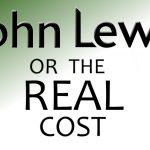
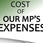
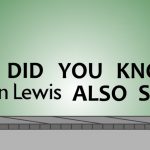
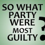
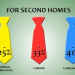
All these stories I wanted to incorporate into my animation to make it humours and different from the rest; then I aimed to round off with the statistics of the Mp’s expenses. To conclude my quotation of ‘The John Lewis List, or the real cost of our MP’s Expenses. So which political party was the worst?’ I created this idea from my statistic to give the animation a purpose.
Overall this project was a fairly difficult one when it came to learning new software and understanding how After Effects works. I had a few hiccups, and learnt a lot of lessons throughout; lessons from keeping files neatly organised (So as to not lose any work!), to understanding the shear amount of time it takes to animate and render. My final video unfortunately is no way near what I had envisioned it to be at the beginning, due to time and skill. And if I were to be able to do it again, I’d stick to my original storyboard before I altered it to include the MP cartoons. That way I would have been able to keep a consistent theme throughout without over-complicating the animation. The ending to my animation doesn’t do justice as what I wanted to create, with running out of time; I was not able to animate the last three shots that were showing my statistics. However all of the problems that occurred have been a large learning curve for me, and possibly that was needed in order to improve on further projects.
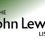
I am however proud of my introduction of the ‘The John Lewis List’ logo; I’m proud of how well I managed to animate it in creating an interesting introduction to the animation. Overall I think the transition of my statistics haven’t worked very well, because of the timing at the end which should have held a little longer to display the figures. Other than the mistakes, I have really enjoyed learning new software and the ideas generation of how to visually represent data, and I can now continue to develop my understanding in After Effects to improve my skills even further.