InDesign
Understanding Page layout:
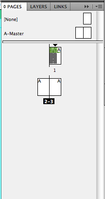
Changing font, with a book with multiple pages, you can use something called master pages. To repeat a layout you need to select the ‘A’ master page, which is locked but is able to be repeated. Command shift and click on an object that’s an A master page to unlock the object. You can then alter than single object on the master page.You can have more than one master page. If dragged on top to another master page, it will overight the last master page. Master page are a big way of saving time, they take a while to adjust to, but i’m sure are worth the practice!
Window- styles- object styles

Object styles is an option to create a style that can be placed on all the master pages to save time doing a layout for each page.
If you want all the boxes to be pre formatted so that they all fit in a perfect way.
Object style will carry over a couple of boxes, so if you select a couple, you can then select objec style. To set one up, its quick and similar as colouring text, you can change the background colour and stroke. You can add a stroke to either the outside, inside or the middle. The end cap is to select a specific line. Corner size and shape. will change the stroke on the outside.
Paragraph styles: Paragraph styles do the obvious, styles for paragraphs.

From there we learned how to wrap text around an image. We learnt to change the distance the text sits from the object, or how much it overlays. We were using directional feathering and many of the options from the object styles e.g. wrap stoke etc. We learnt about frame fitting options and how you can select where to align from, you can select the fitting to be auto. Which is pre setting an image automatically rather than you doing the image manually. We experimented with the effects for objects. There are options for transparency, drop shadow, outer glow, inner glow,basic feather etc.!
These all are in terms of speeding up page layout process. However if you choose specific fronts etc., that’s what’s most important from a design point of view.
If you put text in a text box, something to look out for is the little box at the bottom right and that means there’s more text overset.

