InDesign
More indesign!
The next step after setting up the Indesign document:
Understanding the basics, to work with a grid you need to go to;
Layout – Guides

Starting out with a modular grid 3 by 3 or 5 by 5. Quite often odd numbers is uneasy to the eye. You can click and type in the boxes or click and drag the lines. Using the margins for the grid helps to keep things even, and equal. You don’t want to put a any design in the margin to do this select ‘fit guides to margins’.
Understanding photos in InDesign;
/* Style Definitions */
table.MsoNormalTable
{mso-style-name:”Table Normal”;
mso-tstyle-rowband-size:0;
mso-tstyle-colband-size:0;
mso-style-noshow:yes;
mso-style-priority:99;
mso-style-qformat:yes;
mso-style-parent:””;
mso-padding-alt:0cm 5.4pt 0cm 5.4pt;
mso-para-margin:0cm;
mso-para-margin-bottom:.0001pt;
mso-pagination:widow-orphan;
font-size:11.0pt;
font-family:”Cambria”,”serif”;
mso-ascii-font-family:Cambria;
mso-ascii-theme-font:minor-latin;
mso-hansi-font-family:Cambria;
mso-hansi-theme-font:minor-latin;}
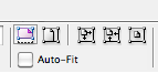
Photos are to be added to an Indesign document using a rectangle frame tool for an image, selecting the yellow box will allow you to alter the shape of the box. To open an image into the rectangle frame tool you click command D as a short cut and then locate the image. To move around with the image to make is fit more comfortably, you click the white arrow.The top of the tool bar there are a few options to help the image fit within the rectangle frame, for example you can stretch the image across, fit it proportionally etc.
These are helpful when working with all images.
Understanding Text:
/* Style Definitions */
table.MsoNormalTable
{mso-style-name:”Table Normal”;
mso-tstyle-rowband-size:0;
mso-tstyle-colband-size:0;
mso-style-noshow:yes;
mso-style-priority:99;
mso-style-qformat:yes;
mso-style-parent:””;
mso-padding-alt:0cm 5.4pt 0cm 5.4pt;
mso-para-margin:0cm;
mso-para-margin-bottom:.0001pt;
mso-pagination:widow-orphan;
font-size:11.0pt;
font-family:”Cambria”,”serif”;
mso-ascii-font-family:Cambria;
mso-ascii-theme-font:minor-latin;
mso-hansi-font-family:Cambria;
mso-hansi-theme-font:minor-latin;}
Text is easy to work with in Indesig using the text tool in the left hand options bar, if have a selection of text and would like to create columns then this is a handy tip: To link a text box, you drag one out, and then click the bottom white box and you can either click on an existing second text box, or then drag out one after you’d clicked on the bottom white box. This will link to two allowing the text to flood from one to another.
Clicking on the text, there’s a bar at the top with options way beyond the abilities of illustrator.
Tips to consider:

Word will ad pixels to made something bold, InDesign will not force a bold setting upon any typography, the only option with italic is ‘semi bold’ which will not always appear on a font.
Leaving the text size around 9 or 10 points is acceptable.
Changing the point size of text. It also changes the value of the leading in-between. It works out what the best leading will be.
You also have the option to change the text to small caps and all caps.
Superscript option will make the writing higher like a squared number and writing the date. Subscript is scientific equations.
Underline
Strikethrough
Kerning space between he letters. If its set to metrics, InDesign will specify the certain amount of pixels.
If you change to optical kerning, it looks at every two characters and gives them the best fit visually, moves them closer or further apart.
Tracking will look at the entire writing, and will alter the spacing in between all the letters.
Sans-serif fonts will always need a little bit of tracking due to their nature.
The block ‘T’ is how you choose the colouring, with the options of cmyk. If your given a job with specific design, with in indesign things are more specific. Below the colour option is a button to apply a stroke. To add more colours on the far right side is a swatch pallete, where you manage your colours. Clicking top right of the colour swatch box is the option to ask for a new colour swatch. A client will usually specify a colour to cmyk, in which case you can drag the bars around to get the colour you need. They’re semi-accurate, but colours will always mix differently when it comes to printing.

A ‘spot’ colour, is a colour mixed differently to cmyk, you can then select what the client has selected eg a pantone pastel coloured reference. Selecting one of those will add it to your colour swatched. However this is okay for a good printer, giving these options for a digital printer will be very difficult.