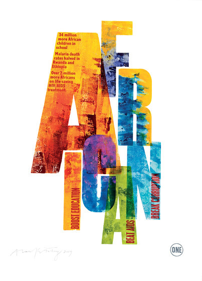
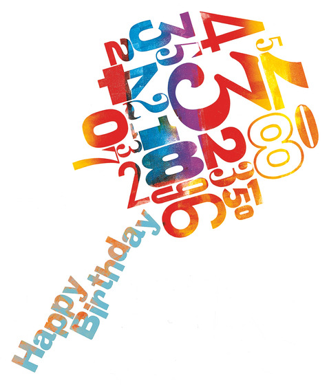
Letterpress – Alan Kitching
A designer, typographer and teacher, Alan Kitching is internationally renowned for his expressive use of letterpress. Not to mention; advertising and his own limited edition prints and ‘Broadside’ publications. He started out as a printer and developed into printmaker and then on to be an apprentice to professor. His work has featured widely such as compositions for corporate identities, magazine and book covers and illustrations; Alan’s work has also featured on postage stamps, theatre posters, shop windows, billboards, signage and a 30 x 15ft typographic mural for the Guardian Newspaper’s London office.
“Breathing life into the dying embers of letterpress … to light graphic fireworks”
I don’t know who quoted this but it’s so appropriate.
Of all the artists and designers, Alan Kitching’s prints are upon the most inspirational I have found. I love colour over anything in design, and it’s that, that has attracted me towards his selection of prints in letterpress. My immediate reaction to his work is noticing the impact the bright colours have, how it makes the typography almost leap out of each design. I find the compositions of each design over all most interesting, as this is such an important role in letterpress. it takes thought and planning with the combination of how unpredictable each print can be from one to the next. Some of the best prints are even accidents letting the ink solely create the design; and from my own letterpress experimenting, I found that that can be an exciting effect. I’m glad to have found an artist such as Alan Kitching, colour is my weakness in design which is what makes his letter print creativity one of the best I’ve seen in the world of visual communication artists.
I have a couple more Letterpress sessions, and through these i aim to take ideas and composition effects from Alan Kitching’s selection of letterpress prints and use them to improve my own work through experimentation and practice.
Some of my favourites: