Front cover design development
Final Major Project – Front cover design development
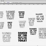
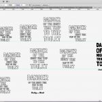
At this point I have started to experiment with front cover designs. Initially I began experimenting with different types of fonts, some very clean and some a bit more hand drawn.
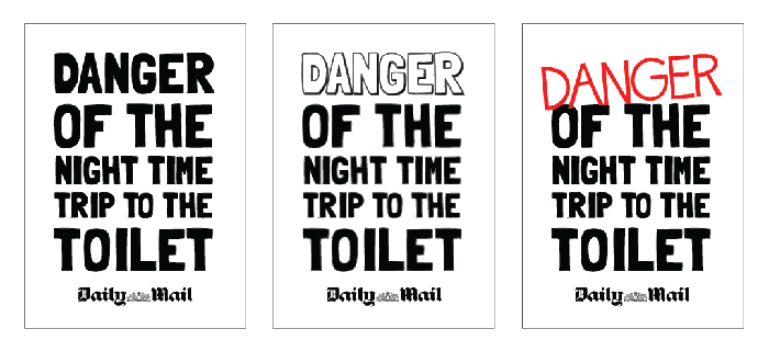
I was thinking of taking this booklet down a more hand drawn graphic style route, which is reason for the types of fonts I have experimented with in the first image (I have screen shot the art board). I find using illustrator easier to quickly throw out ideas of arrangement. I then take the design into In design, but like to start with Illustrator. The hand drawn style would mimic the humour of the content within the book. The idea would be that I will create an equally as silly as the content.
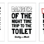
The caption of the front book is one of my articles I have chosen to use, and its the one I find the funniest. ‘Danger of the night time trip to the toilet’ will catch the attention of readers, because of the odd title. I wanted to not include anything to do with cancer on the front because of the sensitive issue related which is the reason for an article title instead!
As well as a hand drawn style, I’m interested into taking the arrangement of title and body text similar to that of newspapers. Catchy bold headlines followed by much smaller body text. Which is the reason behind the capitals for the front cover.